Friday, September 20, 2013

The Mind's Overflow, Vol. 1 + behind the scenes


My friend recently was going through her inventory and look what she bumped into, one of my first endeavors in self-publishing: The Mind's Overflow, Vol. 1! It's a 69-paged anthology that has comics, poetry, short stories, and more comics that my partner-in-comicbook-making-crimes Alan Abbadessa-Green and I put together. You can see also in the pic above that it is "suggested for mature readers." As I remember, it was a massive labor of massive love.

May I remind you of the bars to your right? Do you see the Books I'm In section? Notice that Mind's Overflow has been there all this time? Here's the post all about it.

Inside, you will find an exciting sneak preview of Philip Clark's Quantum: Rock of Ages comicbook series. Philip Clark is soul musician by trade, and trust me, he can rock a soul out of your body. Check out his site for some free listening. I would suggest The State of the Blue-Eyed Soul. But he is an apt writer of comics also. You can read an IGN interview about Quantum: Rock of Ages here, you can read issues #1-4 for free here, and even issue #5 here (with art by James Rodriguez), yes, for freeee! Come on, you know you want to. Give indy comics a read. You'd be surprised how much of high-quality stories are in independent comicbooks. Forget super-heroes; they're so establishment. Indies are in and they're sexy!

Inside Mind's Overflow are also some comic strips by Jeffrey Plotkin. Just do yourselves a favor and go to his link in the last sentence. At face value it looks all cute and cartoony, but his strips are deep when you read into them. He can say a lot in one picture. Here's a random page from his DeviantArt gallery so you can see what I mean: http://emperornortonii.deviantart.com/gallery/?offset=3024.

Alan Abbadessa-Green and I, while planning all the logistics of The Mind's Overflow, came up with a couple of themes, keys and key holes being a central one. So as you can see, the cover has a key hole, giving you the illusion of you peeping inside the book. The cover illustrates one of the short stories, 'A Dying Bird' by Matthew Scott Carr, illustrated by Joe Kelly. All the stories and poems had a front page like this, with the title and credit and a key hole giving a glimpse of the inside of its respective story.

Yours truly was Editor, Art Director, and one of the general illustrators. Alan Abbadessa-Green was EIC. He would read all submissions, sift through the ones he likes so I would read them, I would sift through the ones I selected and we'll discuss the finalists' submissions to select which ones will end up in the anthology. I made the cover design and logo, as well as the design for. Every. Single. Sixty-nine freaking pages! And this is before I knew how to mess with InDesign! Both the designing & illustrating and the editing aspects of creating the book were arduous work for both of us, but I enjoyed it immensely (and I know Alan too). Publishing is something I can definitely get used to. Creating a book from scratch just seems to be what I like to do, and I'd do it again (hint, hint).

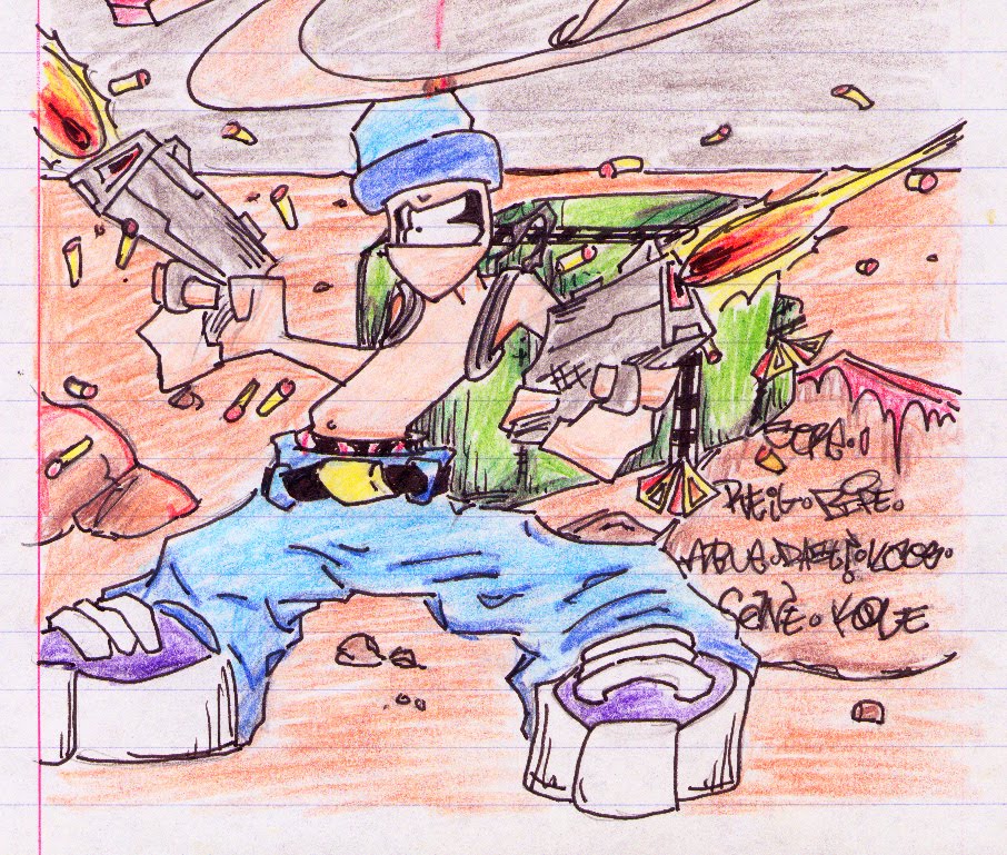
Below is an example of some of general illustrations I did for MO. It's from one of the short stories 'Return' by Miguel Ortega.


Below is another of my illustrations. I like this one because the guy is a writer and he is real. Yup, a real existing writer. I also think the illustration's cute. This drawing is from the introduction, written by Alan. He mentioned how we bumped into this writer at a comicbook convention, sitting at his table selling his books (he's a prose writer, not a comicbook writer, but comicbook conventions tend to not be exclusive like that. God bless them). We kicked off a conversation and it impressed Alan. Here's a glimpse from the introduction (by the way, a reminder, this is For Mature Readers Only, so if you don't have the stomach for cuss words, you might as well skip the quotation):
Step in the fat guy. While at a convention, I see Rammer talking to a fat man sitting behind a desk. I decide to join them and see who the fuck this guy is. It turns out he's a sci-fi/horror/fantasy writer (which I should have known from looking at him). Being the artistic whore that he is (and has to be in this industry), Rammer asks if he can be considered to do artwork for the guy's book jackets. This somehow spins into a conversation about how to make it in the industry. And by "the industry," I don't intend to limit that to comicbooks. Comics are particularly hard because the market is weak and saturated (a bad combination) but the same holds true for novelists, screenwriters, painters, and illustrators. Creators are in for a rude awakening when they first try to send their art into the market. But I'm getting ahead of myself.

Anyway, the fat guy says that if you want to be successful, there is a very easy way to do it... Do it. It's as simple as that. Here I shall try to quote him as best as my memory will allow [yes, a double quote. So what? You're in a house of mirrors here.  —Rammer]:

"If you want to be a writer, write. If you want to be an artist, draw. Every night, even if it's just a page a night. In a year, you'll find you have a book. If someone invites you to a party, decline the invitation. If you want to go out on a date with a girl, don't. If you want to have a life, too bad. Hell, if you want to, I'm fine with that. There's already too much competition for me out there and I'd be very happy if you didn't pursue your work. You'd be doing me a favor to sit home and watch TV. But if you want to do it for real, you have to actually do it."

Now, this isn't original advice, but it's true. I'd actually given my brother similar advice when he was having difficulty finding the time to write. I suggested he take baby steps. A page a night. It was advice I had given him but had failed to practice myself. I say this man may have saved my life because he re-instilled that work ethic within me. Now, whenever Rammer and I are tempted to meet at a bar and drink our paychecks away, one of us will always remind the other to "be the fat guy." And it's advice I pass along to any of the inspiring writers and artists out there. Be the fat guy.
And I'm passing the advice forward onto you. Be this guy.


I know I will see him in another convention in the future. He always makes sure to have a table. What a hustler. When that happens, I'll make sure to buy one of his books and get his name and mention it here.


Now, without further ado, I'd like to present to you my contribution to The Mind's Overflow, Vol. 1: the comicbook story by the same name, drawn, inked and lettered by yours truly, more drawing and inking by Jeff Ploktin, and with writings by Alan Abbadessa-Green, pre-pressed by moi. I really enjoyed this one. It's very unique. I'll tell you why and how. 

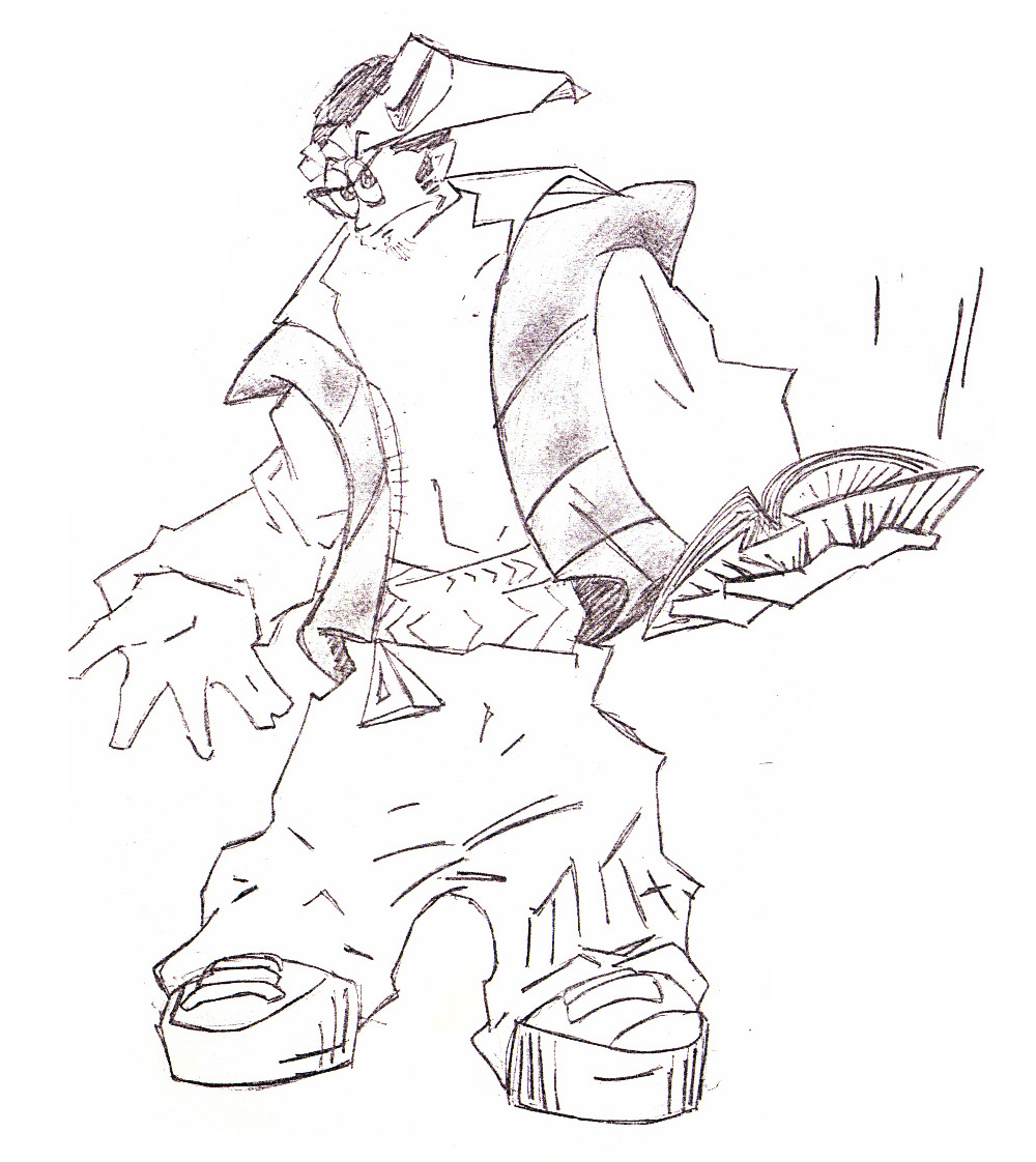
First, the main character, Key, man he's something that can only come straight out of Alan's head. "Make his feet HUGE," he tells me. I give him this:


He tells me, "Make them BIGGER!" LOL. So I gave him this.


Play close attention to his face. He's like a realistic cartoon in a unrealistic real world. His hair is something else. The hair would convey and echo the emotion Key's going through and/or direct your eye to the focus for that particular panel. It's a great visual aid and aesthetic in character design. 

Here's a character design for Molly, Key's girlfriend, just to be fair for both characters.


Now, I will tell you why this is a very unique comicbook. You see, in the story, Key goes to another dimension. Alan had the idea to do something visually interesting: have one kind of artist draw the characters in our dimension and the background in the other dimension, while having another kind of artist do the vise versa. Being that I like to stick to details, he chose Jeff Plotkin as the other artist, for he's more on the comic strips/cartoony side. It was an intriguing and unique progress.

This is the first segment to 'The Mind's Overflow' comicbook story, starring Key. Another reminder: this is For Mature Readers, don't like cuss words? Please skip the comic. Hope you enjoy it!


Here's a bit more from behind the scenes:


Alan Abbadessa-Green wrote about The Mind's Overflow book and comic too over at his blog Look At All the Happy Creatures, but in completely different take.

I have fond memories of Alan and I going to Baltimore, MD for the not-so Small Press eXpo con. We had tons of material and art work to show, plus MO. I also met a lot of creators that I still am proud of knowing to this day. And guess what. The Mind's Overflow, Vol. 1 ended up in the Baltimore Museum of Art's Cram Sessions: 02 Dark Matter exhibit! That's what pays to go to cons as a creator.

Alas, The Mind's Overflow was an endeavor that ended prematurely. With all of life's demands and anguish, there is no Volume 2. But Alan and I still work together. Since then we've made tons of comicbook short stories that ended in comicbook anthologies. He continues to writes books, like The Sync Book (Vol. 1 and 2), one of which we have work in. We have our 8-page comicbook story 'Desperate Skin' in it, and I have two poems in there. I ended up becoming a poet of sort and host a monthly party and open mic while doing gigs in Graphic Design (if you're interested in my writing and poetry, may I direct you to my writing blog I, Rammer? If you are, thank you and I hope you enjoy it). Comicbooks is still a love of mine. I put comicbooks and graphic design in one set; they're the same to me, just with the same elements re-arranged differently. But that's a topic for another post.


Although The Mind's Overflow, Vol. 1 is out of print, you can still purchase a copy for a measly $6! I have like five of them left, I'm sure Alan has one or two, but there are two copies of The Mind's Overflow, Vol. 1 at NYC's Forbidden Planet comicbook store! Just go there and ask for it.


Hope you enjoyed the post. And if you've been reading and looking and have gotten here, all I have to say is:


(the Happy Face bag is the last thing you see at the last page of MO. We also had a ton of those bags to put MOs in when costumers purchased it. So, Thank You for reading!)

;-)


Wednesday, June 19, 2013

What the G says to the O in GOD.

While the D is clueless. I figured the D is clueless because it's countenance seems to look to our right; the G is also to the right, so it would speak to the O, a frontal and very egalitarian vowel.

Hope you like.

Friday, May 31, 2013

Layback

Know those ubiquitous figures in train stations forever sleeping, like they've been caught up with their beauty sleep and they're now on triple overtime? 

Sandman catches them when they least expect it. It can be anywhere. He waits in those interstitial moments that lies a true vacation. 
 
Done in watercolor and color pencil.


Tuesday, May 28, 2013

Hands in Poetry

Here's a nice straight-forward charcoal and pencil drawing of hands in the process of typing poetry. Any other hand models out there? :-P
Enjoy.

Friday, February 1, 2013

Word at 4F

 
I've been noticing something of late: house parties in NYC are beginning a certain kind of spike. There's the guys at 5fity 5ive, all about all the different kinds of house music (not to be confused with "house party"), providing parties all over NYC, but originally began as a house party at Apt. 55. There's When We Were Kings, a '70s themed party in Brooklyn that happens at a regular basis, also at an apartment. I know of my good friend Alba Mota's Sancocho parties, where she and her friends have a huge pot full of that good ol' Dominican soup, where partiers can scoop their own bowl of sacocho when taking a break from dancing some Latin music (aside from other genres), and I'm sure you already know in what kind of venues they throw it down.

But right now I want to treat you to the 1st of a series of spoken word, readings, music and stand-up comedy parties where, yes, you have all these literary and showcases going on, but it's also a bonafide BYOB party. I'd like to introduce you to...


WORD AT 4F!

WORD AT 4F's intention is to cultivate poetry and a literary community at Uptown NYC. If you're interested in attending tomorrow, Saturday February 2nd, to party or to perform, please RSVP to wordat4f@gmail.com (after all, it is a party at a very homely home, so some crowd control would be need). This will be a series that would happen roughly once a month, made and hosted by Angela Abreu and yours truly!

And a big THANK YOU! goes out to Angela Abreu for opening up her home to the world for the art and the power of the word.

Tuesday, December 18, 2012

"Thank You" Menorah

"Thank You" Menorah
This was a "Thank You" card I drew, a typographical menorah drawing saying "Thank You" I did for a doctor. I really lucked out on the "N" and "K" there. Done on pencil and color-pencil, free-hand.

Tuesday, August 14, 2012

Headshot Retouch

This is Luisa Inés García.

Actress, with many different side-skills that can be appropriated with her craft. (Directing, Writing, Poetry, Acting, Dance, I believe she does Costume Design, and even freaking Gymnastics)

I did some retouching for her Headshot earlier this year. I tried to smooth out the natural blemishes while keeping true to her look and aura/aesthetics, while enhancing some other areas. True, I could have taken some more of those stray hairs, but dammit if the hair doesn't end up looking like she's wearing a head-piece that looks like hair. You would notice there's probably a 20% increase in eye size. Yup, the rules of subliminal allure, made not-so-subliminal in this blog.

Here's little bio of Luisa Inés García:
Luisa Inés García earned her BFA from NYU’s Tisch School of the Arts (PHTS) in Creating Original Work and Acting. For the past two years she has worked in New York, New Jersey and internationally as a director, actress/dancer and teacher. She most recently co-founded Buffoonocene Productions with Seth Baum (Columbia University’s Center for Research on Environmental Decisions), which creates new works built on scientific research to stimulate dialogue and promote activism regarding climate change. The project was debuted at this year’s Nature, Ecology and Society Colloquium at the CUNY Graduate Center and the newest video will be available on YouTube soon! She currently plays the role of María Teresa in In The Time of the Butterflies at the Spanish Repertory (Repertorio Español) .

She's currently directing El Coordinador. “The Facilitator” takes place in an elevator where four people must deal with the ambition and morals of the others. Shut in the elevator, they experience a collective desperation that results in the discovery of the true personality of each person when their fears and virtues come out to play in this game of survival. Winning play of the 1993 Best Dramatic Text Award at the VII North American Chilean Institute’s Theater Festival and the 1994 Municipal Award for Literature in Theatre in Santiago, Chile. 

They have 5 performances!
August 23: 7pm
August 24: 8pm
August 26: 6:30 pm
August 30: 7pm

and
August 31: 8pm
 

Written by: Benjamin Galemiri
Directed by: Inés Garcia
Assistant Director: John Gutierrez
The players: Antonio Solar, Billy Martin, Elena Sanz, Ron Sarcos
Set design: Leni Méndez
Sound design: Erin Cummings
Light design: Miguel León Valderrama
Tickets are $10, with premium seats at $20
The play is in Spanish with simultaneous English translation.

You can find more info on El Coordinador.

Tuesday, May 22, 2012

I crown you, Mother

My mother had her birthday yesterday. It's been a surreal year so far for the family, so I wanted to give her something original, as original as her love, contribution, and warmth that she brings (so, yea, so I'm a mama's boy, yea, I'm a son).

I wanted to do a calligraphy piece from a poem of a poet she likes, Pablo Neruda. But after I found "Sonnet 31", I wanted to crown her with his words more than concentrating on calligraphy. I recently purchased a Pilot Parallel Pen, which I'm excited about, but it has a wide nib, big enough that it didn't give me room to draw the foliage deco that I wanted to design with the size of Bristol board I have. So I settled with a less cooler calligraphy marker.

With the spirit of being original, making a piece that's un-repeatable, captured in the moment, and of being on time, I wanted to do this as a stream of consciousness. I winged the calligraphy, with only one horizontal line drawn in pencil showing the top of the x-height of the first line of the sonnet as a guide to the rest of the poem. The decos are winged too, only loosely sketched in pencil first, just to make sure I have room for everything. I only looked at the visions the poem paints as inspiration.

It's in Spanish, for we are a Spanish-speaking family.

Soneto XXXI
 The shape of the paper is designed so I can crown her with the poem (and I did), like the Romans wreathed themselves (notice how the two loops can go around the ears).

This is the poem in Spanish and in English:

Soneto XXXI
Con laureles del Sur y orégano de Lota
te corono, pequeña monarca de mis huesos,
y no puede faltarte esa corona
que elabora la tierra con bálsamo y follaje. 

Eres, como el que te ama, de las provincias verdes:
de allá trajimos barro que nos corre en la sangre,
en la ciudad andamos, como tantos, perdidos,
temerosos de que cierren el mercado. 

Bienamada, tu sombra tiene olor a ciruela,
tus ojos escondieron en el Sur sus raíces,
tu corazón es una paloma de alcancía, 

tu cuerpo es liso como las piedras en el agua,
tus besos son racimos con rocío,
y yo a tu lado vivo con la tierra.

Pablo Neruda 1959

Sonnet 31

With laurel from The South, and Lota oregano,

I crown you, little monarch of my bones,

and you cannot do without this crown,

that the earth elaborates with foliage and balsam.

You are as he who loves you, from the green provinces:
from where we brought the clay that runs in our blood,

In cities we go about, like so many, lost,

fearful that the market will be closed.

Beloved, your shadow has the plum's aroma,

the roots of your eyes remain hidden in the south,

your heart is a dove-shaped collection-box,

your body is as smooth as stones in the water,

each kiss a cluster covered over with dew,

and I, at your side, live with the earth.
 
Pablo Neruda 1959

"Sonnet 31" is 61 years old. It's older than my mom. :-) 

Happy Birthday, little monarch of my bones.

Tuesday, February 14, 2012

She Is

She Is

Happy 2012 Valentine's Day!

This is She Is, about 14 inches squared frame, written by yours truly and made by hand, with love for love. It's sits in the home of she.

This is the text to the poem:

She Is

She is that way.
Her manner is affable,
vision and sound. Soothing
and I will never stop her bantering
so I'd reminisce if I become lovelorn.

She is her smile.
Her smile is her joy.
Her voice is pleasant to my
ears, like the waves and sounds
of foams from the sea by the beach,

and the dunes of warm sand are her skin. The makers to her words, her lips, do her
voice justice. The creator to her words, her heart, is always true to her soul. Kissing
her during the summer, and I kiss the warm summer rays. Kissing her during winter
I kiss refined snow. You would want to hear her nature as you sleep, in hopes you
dream of resting times, dreaming a long dream. Her lips feel like marshmallows.
the soft ones. Not viscous like honey, but a bit diluted like marshmallows.
not sweet like honey, but a bit tender like brown sugar. Making me yearn
for more. And whenever she speaks to me, her words travel through my
ears pass my veins and wind my heart into a golden glaze. When she says
“hi” to me, I feel my body soothingly warm. It’s because I feel as
though she is here, with me, in front of me, with open arms. And
she warms me. She is what I look forward in·a day, or pass
many days. One can say this about few people; her way
manner and words are all the act of her heart in
fruition. She is the reason to my ambitions,
the fuel of my intellect and joy. She is
the lovely hand that genuinely
cares. She is lovely, every
day in every way.
She is lovely.
She is love.
She
is.

Friday, May 13, 2011

Beyond the Four Walls:
The Rising Ministry and
Spirituality of Hip-Hop

Hi everyone.

Below I present to you a book I designed named
Beyond the Four Walls: The Rising Ministry and Spirituality of Hip-Hop
by Walter Hidalgo.

Monday, January 31, 2011

Marilyn Manson's Antichrist Svperstar

This is a hypothetical CD cover I did for an existing artist of my choice, as an assignment for illustrator Tim Okamura. I gotta say Tim's a stand-up kinda professor and person. He taught me tons and even more via example. There's a nice Wiki entry of him that shows some of where his paintings have been featured. And, since I just wrote about graffiti on my previous post, it's only fitting to mention that his work is very Hip-hop. To quote a quote, "...a painter who does portraits with tumultuous graffiti backgrounds....a hip-hop painter". --Nicholls,Liz (October 29, 2005).

In this assignment, he played the music from each corresponding CD that each student brought. He played Antichrist Superstar as he displayed the illustration... Isn't it fitting? :-)

This is collage with acrylic, trying to convey the character of Antichrist Superstar in all three of his incarnations, the man/boy, the worm, and the Svperstar!

Saturday, January 29, 2011

Graffiti Galore

The following shows my graffiti side.

I'm not sure if I mentioned this before, but I feel graffiti is a definitive expression of what goes to the core of what typography, calligraphy, and graphic design is all about. There are countless graphic designers in its rich history that began their artistic endeavors in tagging on the wall, spraying throw-ups or wild style graffiti anywhere they could. There are also a lot of letterers, doing signs on grocery stores and supermarkets, painting on the stores' cinder blocks that would make any graphic designer jealous. These people also turn out to become great graphic artists.

Yet the determining results are the same. One tries to be legible and readable, following the rules of type in such a way that its appeal lies with how well the rules are executed, how elegant and crisp it seems with the bounds of its physicality, whether on painted plaster, chalkboards on a wooden easel, or canvas signs hanging overhead. The other is on the yang to its yin's side of the spectrum; its beauty lies in how well the artist is breaking the rules, how much can the artist abstract type beyond the point of recognition. "You can't read it? Too bad! But the letter form is there somewhere, if you look and not just see." And that probably says something more than its conventional cousin, for by stripping away what makes letterforms relate with other stylized letterforms, you're ratifying what defines that very letterform to its essential anatomy. And as they're tearing apart the constitution of graphic design rules, they're enjoying it, having their fun as they rent! You better believe that when you see an exceptional piece, you think that piece was done with fun in it, it may be a serious kind of playfulness, but you can't deny that you're looking at it in every color, in every stroke. Some graphic or type artists can learn a thing or two from graffiti artists.

I did these at different times, different spaces in life. Hope you enjoy them.


I'm working on something new, something very very new! Yup, said too much. You've probably guessed it already. Keep your eyes open and stay tuned.

Friday, January 1, 2010

The Decade of Nothing

Here's to a decade that now is part of the void that its type symbolized: the Nothings before the Somethings. No one knows what to call it. Some call it the "Naughties", others "The Big Zero" or the "Double-Os". Regardless, the nature of a name with this number-logic had a psychological effect on me. The mortality of seeing a number, a decade, counting down (or up, depending how you look at it) makes a person want to seize it before the next number. Something about '00s creates a different flow.

I don't know what to make of the decade; there were a lot of ups and downs, bests and worsts of. But maybe that's the point. Don't have an absolute claim to make in such an expanse of time, but make it bold for the next decade because you already know how it is not to. The Nothings before the Somethings, turn to the Nothing that Is.

And with that I give you a nice The Decade that Passed present. It's a free-association drawing I did in '01. I thought it fitting for I drew it in the onset of the decade (it starts with the first year, not '00, you know), a worldly, significant, sad, and impressionable year, and because as a free-association drawing, making it as you go along without consciously knowing what you are drawing, with no intentions, making it seems a lot like life itself. And also, it's a drawing of a nascent of a man waking out of his cocoon. Yes, very fitting.

Happy Decade that Passed and a Happy New Decade!
(hey, you only get to say 'Happy New Decade' once every ten years; make it count!)


PS: Thank you so much to everyone who Subscribed to SmokyMirrors! I so appreciate the love and interest. This is the kind of thing that keeps me moving onward.

And to those that are not in the know, to my first 100 Subscribers, as a big "Thank You!" for letting me into your Inbox life, I'm drawing small limited-edition sketches. One-of-a-kind drawings about any subject matter you desire, drawn specifically for you, and I'm only doing this for 100 people. I still haven't reach my first 100, so there's still time to have something cool.

Sunday, December 6, 2009

Fesk

Mag spread graffitiesque (or urban calligraphy/typography, as it's being called as of late). Done with color-pencil, a bit of watercolor, markers, and Photoshop for embellishment. I left negative space for the headline, subhead, and lead-in paragraph of a hypothetical article.

That's my tag right there.

FESK Mag Layout

Wednesday, December 2, 2009

Rammer Totem

Take a gander at another Rammer logo, a symmetrical totem. I'm not sure but I think this one constitutes a bilateral/mirror-image ambigram too (can any ambigram friends put me on whether or not?). Though there are some negative space issues here, doesn't it look like a person, or if you rotate it, a fish? And the name can repeat itself vertically ad infinitum (a la wallpaper), for the first 'R' is the same as the last 'R', forever.

Rammer Totem

I'm following up my previous post's last drawing, the one with the logo and abstract lady. It was an abstract, monoweight, geometric, black/white theme I was going for.

Monday, November 30, 2009

Studying (?) in class... Sketches

Here're some quick line sketches, the roads of my neurons, while thoughts on the topic at course careen ablaze. Well... It's a multi-tasking possibility. Have fun:


Oh, his one I must comment specifically. Abstract symmetrical logo doodle of, guess what website... (plus a dash of a hint of a foggy layout). I like the lady in particular.

Monday, March 9, 2009

Friends

Every now and then I draw whatever I see, sometimes scapes, sometimes things, sometimes my friends. Here a some of the latter:

Joshua D. Cochran
Joshua D. Cochran is a writer. I had him as my prof for my last English class in City College of New York. He has a book, Echo Detained from Fractious Press on Amazon.com, and though I never read it, he and I share publication in City College's Promethean, the 2004 issue. His poem, Dance of the Nomenclature is one of my highlights. Google him; he's around.

This is what happens when you think with your eyes in class:


Lenny
Quick one of my boy Len, while playing cards.


Felix Luis García
Poet with the last punto.


Hristo Atanasov
The random brains behind Rather Random Reality. I play the games he designs and creates, I look at his drawings, I watch (and sometimes contribute) his animation. His latest one won him a spot on the front page and a Daily 3rd Place award on NewGrounds.com. It's called Cigar Wars: Lightersabers Collide!, and worth me reserving a post to hightlight this nice masterpiece.

This drawing says 'Aku' to the left, for Aku is the wickedest shapeshifting master. Actually, there is evidence Hristo might be this world's Aku master:


See!?