Monday, January 31, 2011

Marilyn Manson's Antichrist Svperstar

This is a hypothetical CD cover I did for an existing artist of my choice, as an assignment for illustrator Tim Okamura. I gotta say Tim's a stand-up kinda professor and person. He taught me tons and even more via example. There's a nice Wiki entry of him that shows some of where his paintings have been featured. And, since I just wrote about graffiti on my previous post, it's only fitting to mention that his work is very Hip-hop. To quote a quote, "...a painter who does portraits with tumultuous graffiti backgrounds....a hip-hop painter". --Nicholls,Liz (October 29, 2005).

In this assignment, he played the music from each corresponding CD that each student brought. He played Antichrist Superstar as he displayed the illustration... Isn't it fitting? :-)

This is collage with acrylic, trying to convey the character of Antichrist Superstar in all three of his incarnations, the man/boy, the worm, and the Svperstar!

Saturday, January 29, 2011

Graffiti Galore

The following shows my graffiti side.

I'm not sure if I mentioned this before, but I feel graffiti is a definitive expression of what goes to the core of what typography, calligraphy, and graphic design is all about. There are countless graphic designers in its rich history that began their artistic endeavors in tagging on the wall, spraying throw-ups or wild style graffiti anywhere they could. There are also a lot of letterers, doing signs on grocery stores and supermarkets, painting on the stores' cinder blocks that would make any graphic designer jealous. These people also turn out to become great graphic artists.

Yet the determining results are the same. One tries to be legible and readable, following the rules of type in such a way that its appeal lies with how well the rules are executed, how elegant and crisp it seems with the bounds of its physicality, whether on painted plaster, chalkboards on a wooden easel, or canvas signs hanging overhead. The other is on the yang to its yin's side of the spectrum; its beauty lies in how well the artist is breaking the rules, how much can the artist abstract type beyond the point of recognition. "You can't read it? Too bad! But the letter form is there somewhere, if you look and not just see." And that probably says something more than its conventional cousin, for by stripping away what makes letterforms relate with other stylized letterforms, you're ratifying what defines that very letterform to its essential anatomy. And as they're tearing apart the constitution of graphic design rules, they're enjoying it, having their fun as they rent! You better believe that when you see an exceptional piece, you think that piece was done with fun in it, it may be a serious kind of playfulness, but you can't deny that you're looking at it in every color, in every stroke. Some graphic or type artists can learn a thing or two from graffiti artists.

I did these at different times, different spaces in life. Hope you enjoy them.


I'm working on something new, something very very new! Yup, said too much. You've probably guessed it already. Keep your eyes open and stay tuned.

Friday, January 1, 2010

The Decade of Nothing

Here's to a decade that now is part of the void that its type symbolized: the Nothings before the Somethings. No one knows what to call it. Some call it the "Naughties", others "The Big Zero" or the "Double-Os". Regardless, the nature of a name with this number-logic had a psychological effect on me. The mortality of seeing a number, a decade, counting down (or up, depending how you look at it) makes a person want to seize it before the next number. Something about '00s creates a different flow.

I don't know what to make of the decade; there were a lot of ups and downs, bests and worsts of. But maybe that's the point. Don't have an absolute claim to make in such an expanse of time, but make it bold for the next decade because you already know how it is not to. The Nothings before the Somethings, turn to the Nothing that Is.

And with that I give you a nice The Decade that Passed present. It's a free-association drawing I did in '01. I thought it fitting for I drew it in the onset of the decade (it starts with the first year, not '00, you know), a worldly, significant, sad, and impressionable year, and because as a free-association drawing, making it as you go along without consciously knowing what you are drawing, with no intentions, making it seems a lot like life itself. And also, it's a drawing of a nascent of a man waking out of his cocoon. Yes, very fitting.

Happy Decade that Passed and a Happy New Decade!
(hey, you only get to say 'Happy New Decade' once every ten years; make it count!)


PS: Thank you so much to everyone who Subscribed to SmokyMirrors! I so appreciate the love and interest. This is the kind of thing that keeps me moving onward.

And to those that are not in the know, to my first 100 Subscribers, as a big "Thank You!" for letting me into your Inbox life, I'm drawing small limited-edition sketches. One-of-a-kind drawings about any subject matter you desire, drawn specifically for you, and I'm only doing this for 100 people. I still haven't reach my first 100, so there's still time to have something cool.

Sunday, December 6, 2009

Fesk

Mag spread graffitiesque (or urban calligraphy/typography, as it's being called as of late). Done with color-pencil, a bit of watercolor, markers, and Photoshop for embellishment. I left negative space for the headline, subhead, and lead-in paragraph of a hypothetical article.

That's my tag right there.

FESK Mag Layout

Wednesday, December 2, 2009

Rammer Totem

Take a gander at another Rammer logo, a symmetrical totem. I'm not sure but I think this one constitutes a bilateral/mirror-image ambigram too (can any ambigram friends put me on whether or not?). Though there are some negative space issues here, doesn't it look like a person, or if you rotate it, a fish? And the name can repeat itself vertically ad infinitum (a la wallpaper), for the first 'R' is the same as the last 'R', forever.

Rammer Totem

I'm following up my previous post's last drawing, the one with the logo and abstract lady. It was an abstract, monoweight, geometric, black/white theme I was going for.

Monday, November 30, 2009

Studying (?) in class... Sketches

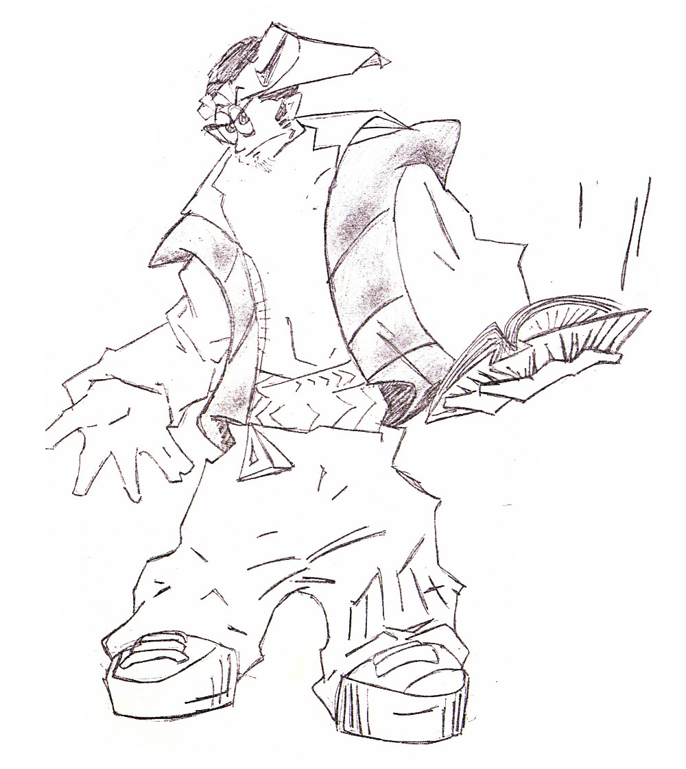
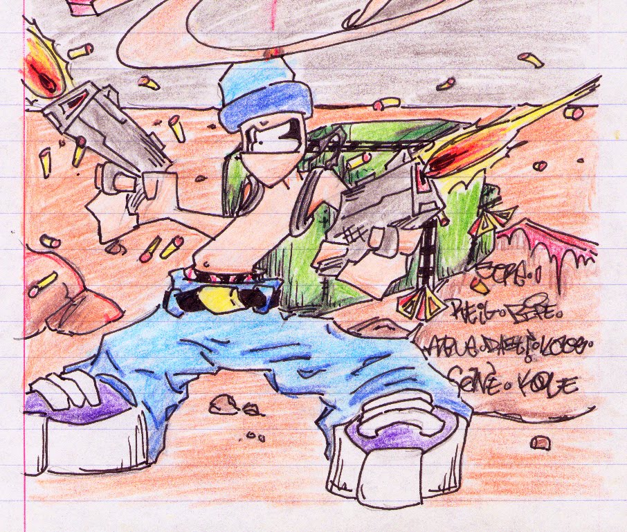
Here're some quick line sketches, the roads of my neurons, while thoughts on the topic at course careen ablaze. Well... It's a multi-tasking possibility. Have fun:


Oh, his one I must comment specifically. Abstract symmetrical logo doodle of, guess what website... (plus a dash of a hint of a foggy layout). I like the lady in particular.