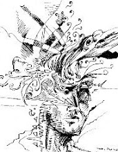
The following shows my graffiti side.
I'm not sure if I mentioned this before, but I feel graffiti is a definitive expression of what goes to the core of what typography, calligraphy, and graphic design is all about. There are countless graphic designers in its rich history that began their artistic endeavors in tagging on the wall, spraying throw-ups or wild style graffiti anywhere they could. There are also a lot of letterers, doing signs on grocery stores and supermarkets, painting on the stores' cinder blocks that would make any graphic designer jealous. These people also turn out to become great graphic artists.
Yet the determining results are the same. One tries to be legible and readable, following the rules of type in such a way that its appeal lies with how well the rules are executed, how elegant and crisp it seems with the bounds of its physicality, whether on painted plaster, chalkboards on a wooden easel, or canvas signs hanging overhead. The other is on the yang to its yin's side of the spectrum; its beauty lies in how well the artist is breaking the rules, how much can the artist abstract type beyond the point of recognition. "You can't read it? Too bad! But the letter form is there somewhere, if you look and not just see." And that probably says something more than its conventional cousin, for by stripping away what makes letterforms relate with other stylized letterforms, you're ratifying what defines that very letterform to its essential anatomy. And as they're tearing apart the constitution of graphic design rules, they're enjoying it, having their fun as they rent! You better believe that when you see an exceptional piece, you think that piece was done with fun in it, it may be a serious kind of playfulness, but you can't deny that you're looking at it in every color, in every stroke. Some graphic or type artists can learn a thing or two from graffiti artists.
I did these at different times, different spaces in life. Hope you enjoy them.


I'm working on something new, something very very new! Yup, said too much. You've probably guessed it already. Keep your eyes open and stay tuned.


