Tuesday, May 27, 2008

Hys


This is Hys; talented MC. Check his tracks. It's rare to bump into an MC that actually has flow and energy throughout. He has a very interesting indy music video directed by fellow comrade Key Soto. Key has a few tracks of his own (by the name of Key Melodics), one of which is a Hys track featuring he. They seem to be a natural together.

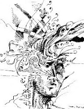
I was strolling the group of photos from Hys's page, while listening, and just saw this montage in my mind' eye. Theme Art's photographs really exercised the various angles and poses Hys can evoke.

Theme Art has a style where he controls light by obfuscating anything that he doesn't want shown. Most of his work consist of portraits and portraitures and headshots, bodies flowing in darkness... very distinctive.

Between them two, this piece had to be done. It's a web exclusive piece, since it was in the spur of the inspiration, and limited to 72dpi, alas. It needs tweaks here and there, but all in all, it was a good exercise.

Monday, May 12, 2008

Two Logos, Out of Five-Hundred

Really Good Logos Explained
For some 'really good' news, the Rammer ambigrammatic logo and the Seven Up logo (not to be confused with 7UP) are published in Rockport Publishers' Really Good Logos Explained, written by Margo Chase, Rian Hughes, Ron Miriello, and Alex W. White. This makes this heap of flesh a happy designer.

Seven Up logo in Really Good Logos Explained
Seven Up is a logo for a column by a prominent news site for comicbooks and its ilk, The Pulse. Seven Up was an interview column orchestrated by fellow comicbook writer Len Wallace where he asks seven questions to up-and-coming comicbook artists. I figured I'd do the logo in black & white since most comicbook artists that're starting out print their comics in black & white for the cheaper price. Check out Len's latest endeavor, Love Buzz with Michelle Silva.

Pages 48 and 49 of Really Good Logos Explained
This is the spread featuring the Rammer ambigram, its neighboring logos, and critique from three out of the four authors/designers. I wonder why any of them didn't suggest to put the logo upsidedown for those whom aren't privy to John Langdon or the advent of ambigrams.
Rammer ambigram description in Really Good Logos Explained

It's good to see that all the attention to negative space and my attempt to take Blackletter away from its current pigeonholes got recognized. The two logos wouldn't be in the book if it weren't for Alex W. White. I took the Electronic Design 2 class and there he was, ready to turn the class into a design bootcamp. Not only did he introduce me to the existence of John Langdon, or the Type Directors Club (of which White's currently serving as President), but he openned my eyes wider, and I began to see the negative space all in the world.

Rammer ambigram in Really Good Logos Explained